DR.POD
DR.POD

Dr. Pod is an innovative check-in experience that combines user interface and physical experience design to promote privacy, comfort, and independence. This makes the transition to a new doctor more accessible to new patients aged 18-22, specifically those transitioning from the pediatrician to the physician; allowing them to become more assertive over their personal healthcare.
Project sponsored by Cognizant
Team Members: Emma Shaw and Taylor Hicks

Primary research

Cognizant presented various types of problems associated within the medical/health care field. Our group chose the research question relevant to the check in experience at primary health care offices and services. The question states: How can we use technology to enhance the patient check-in experience at the doctor? Thus, to sufficiently answer the question, some primary research of the check-in experience was needed, and is presented below.


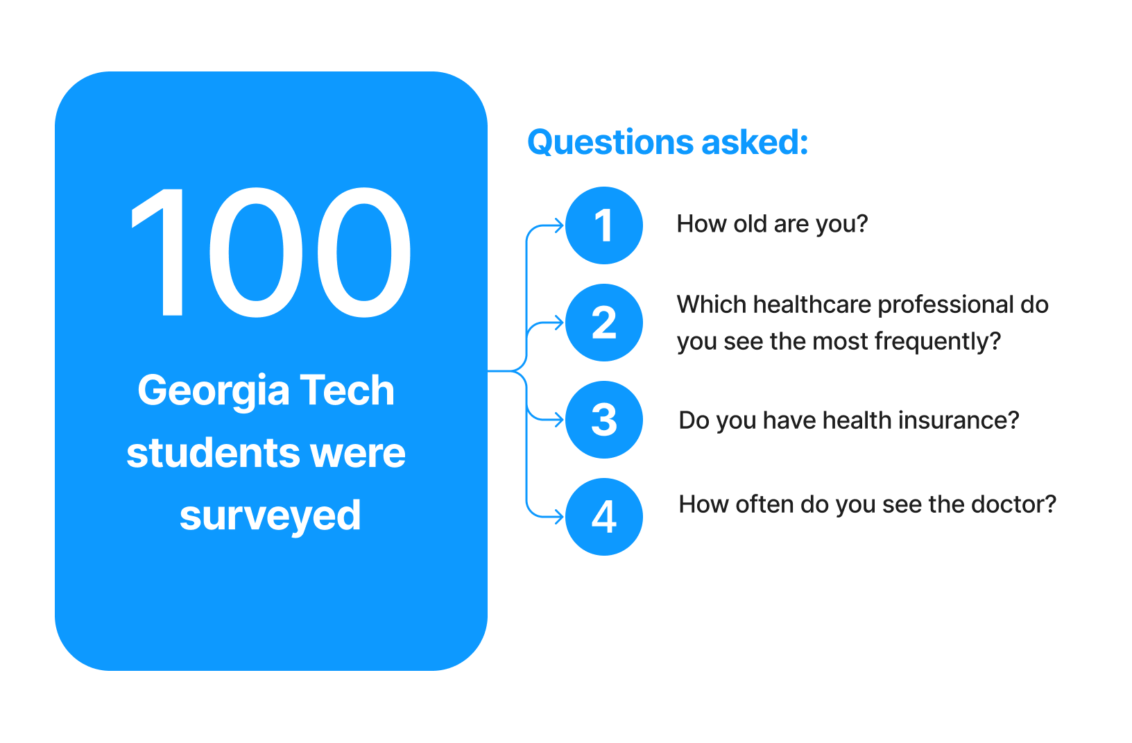
Initial Survey
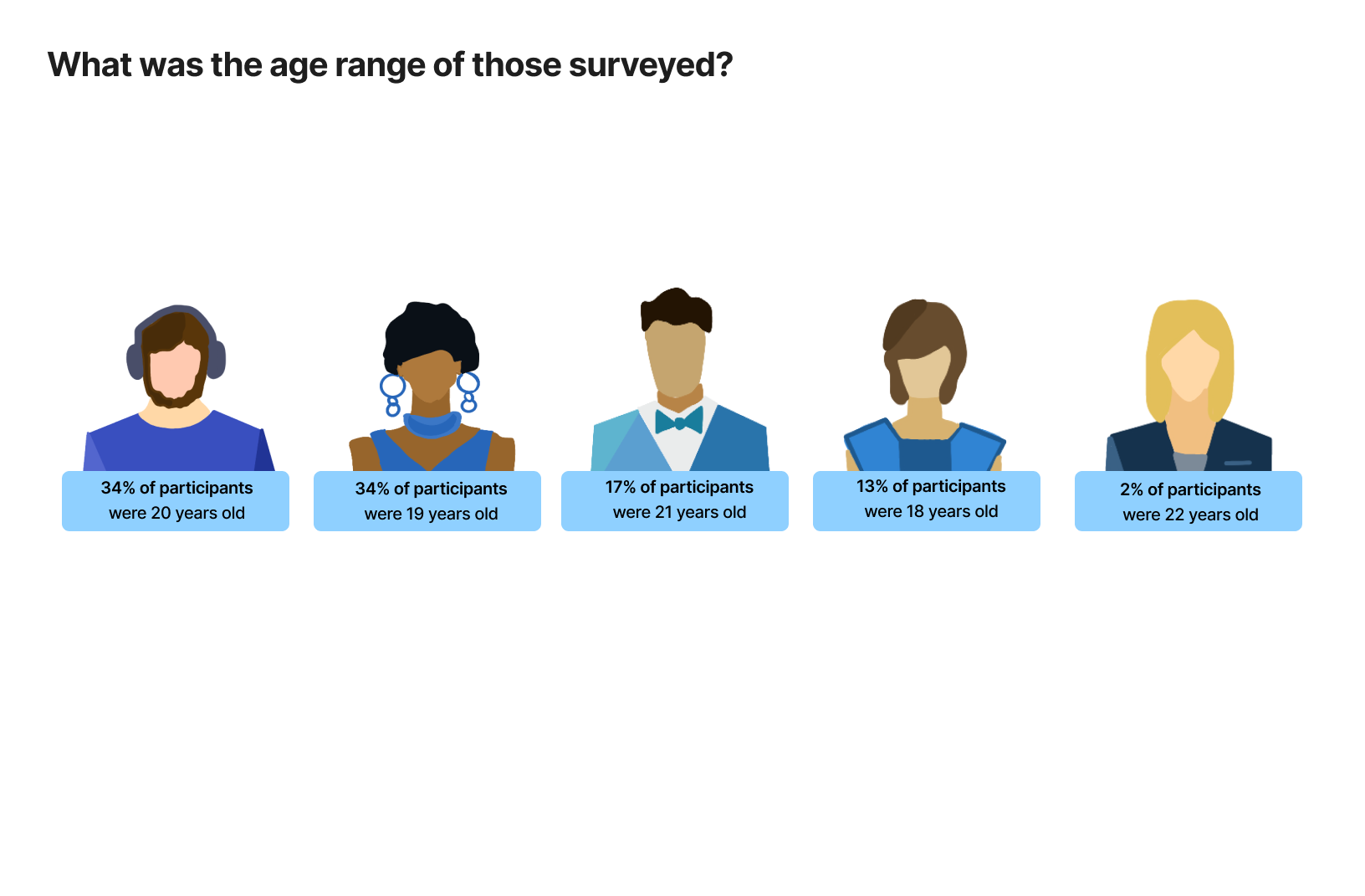
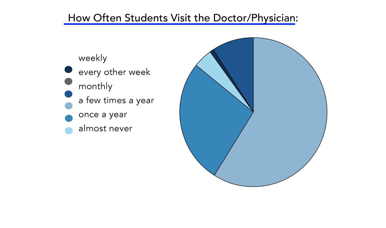
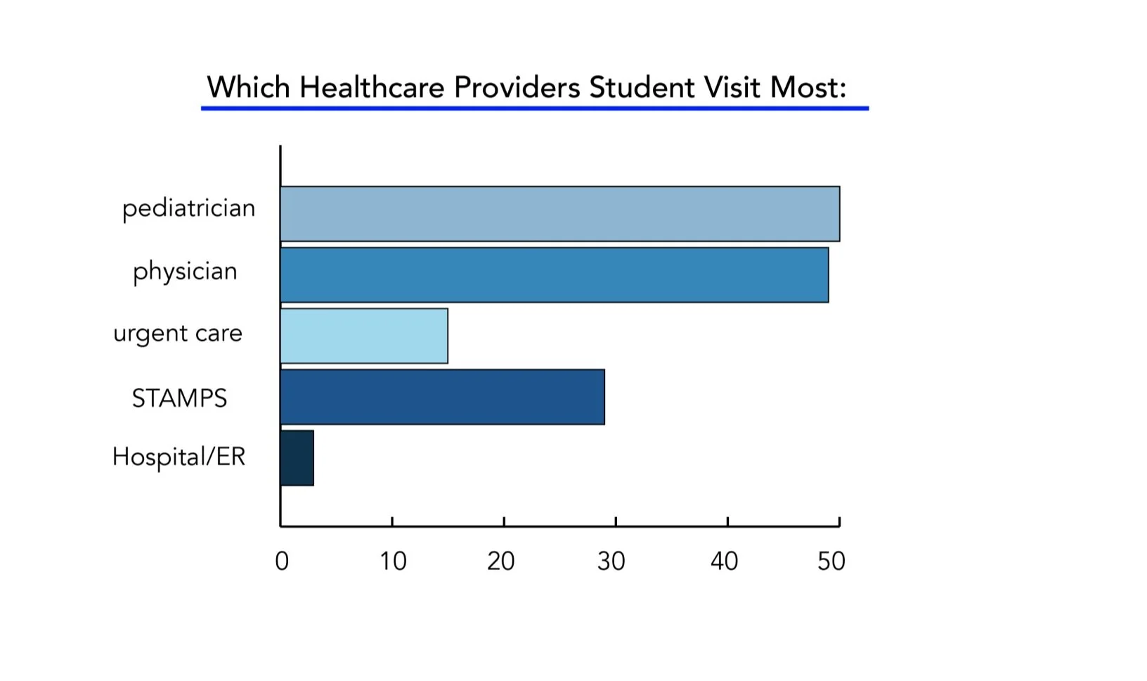
100 Georgia Tech students were surveyed anonymously. Here is the data that was collected based on their healthcare habits:
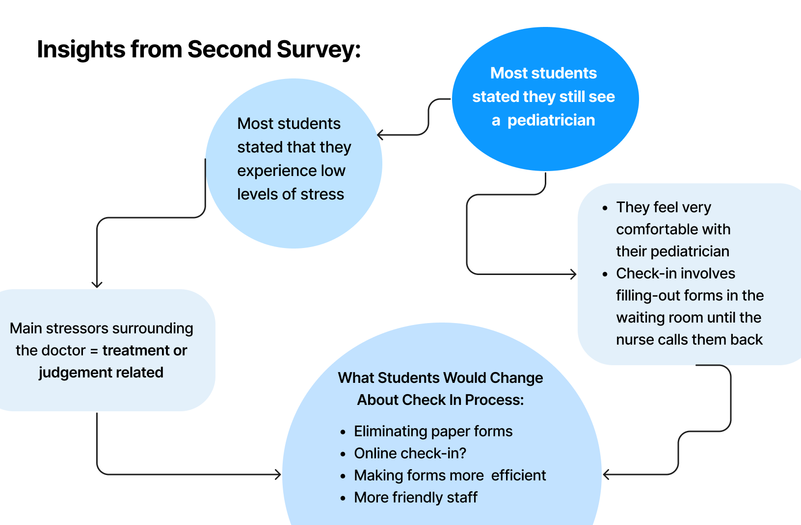
Based on these results, we decided to focus on problems within the pediatrician/physician check in experiences, so we sent out an additional second survey to collect more specific data and insights.
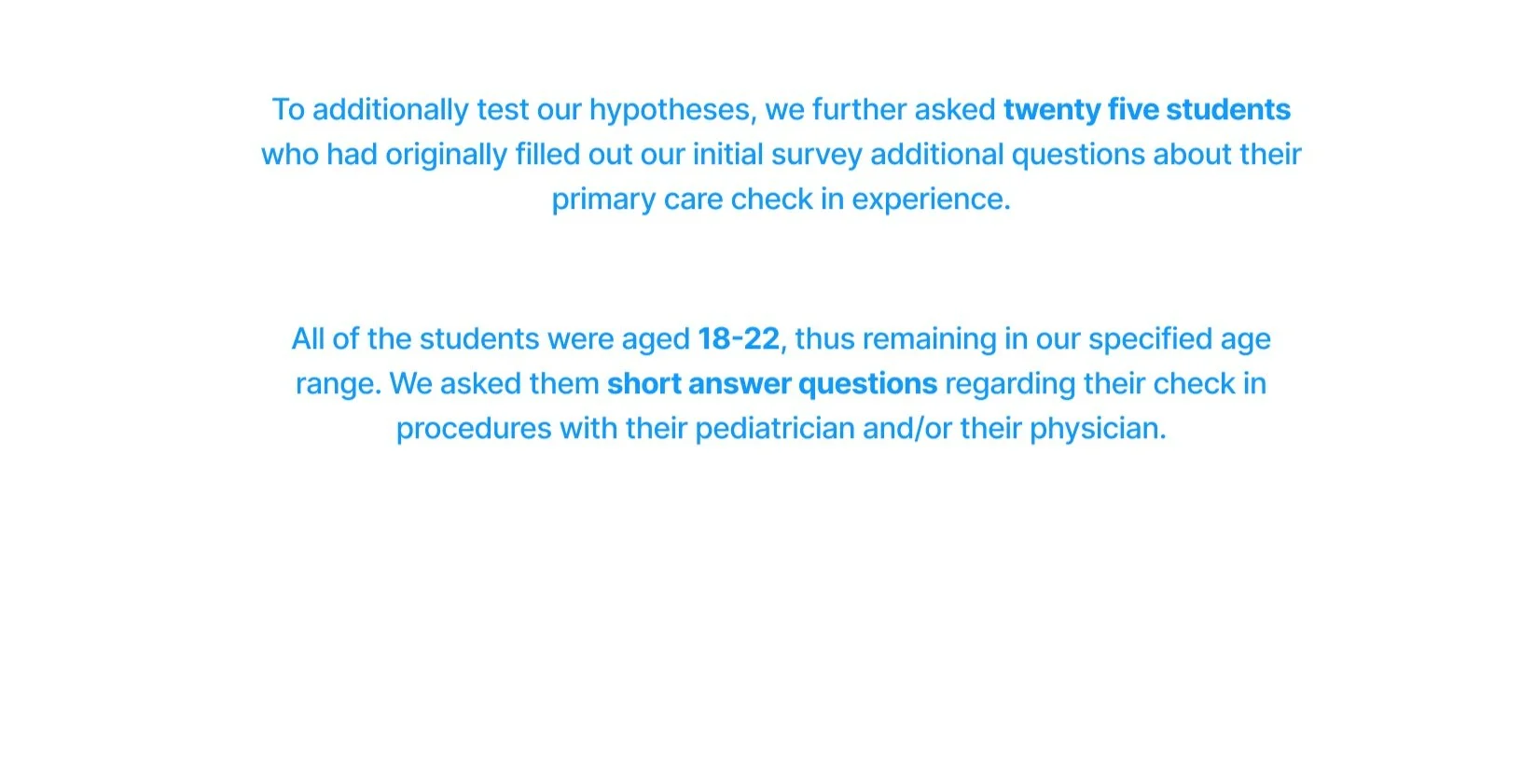
second survey
Interviews
We called the offices of 5 different pediatricians and 3 different physicians, with the intent of observing check-in and waiting room procedures. Unfortunately we had no luck in this in-person research. As a secondary approach to primary research, we decided to interview pedicatric medical professionals and pediatric patients.
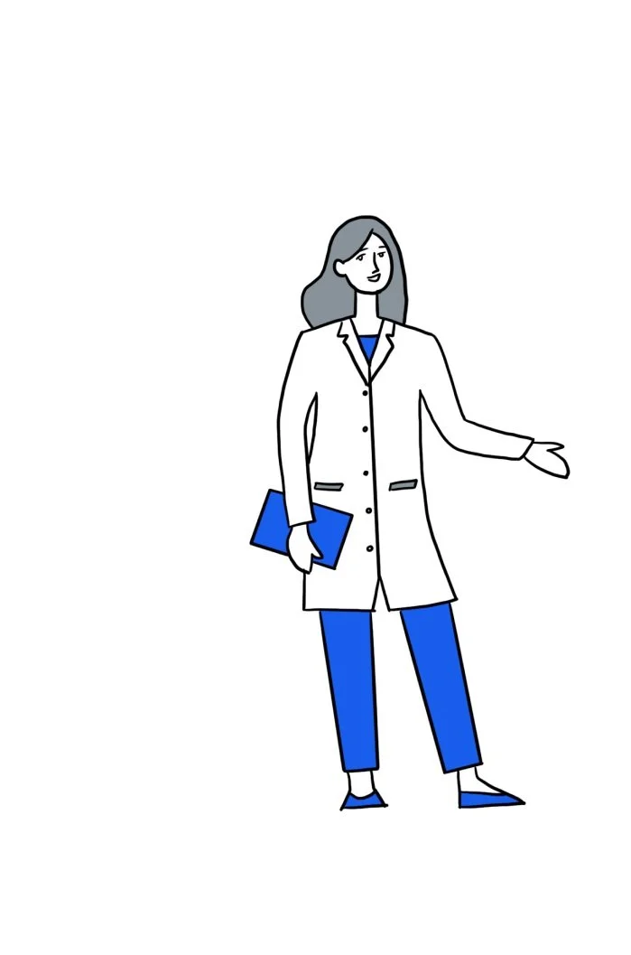
Our group interviewed 3 pediatric healthcare professionals, all serving different roles in the check-in process. The main takeaways from these three roles were as follows:
Distractions such as entertainment or medical forms seem to make the waiting process go by faster for patients.
Being able to see where the patient is in the
check-in process saves the doctor a lot of time.
When patients are late to their visit, it creates
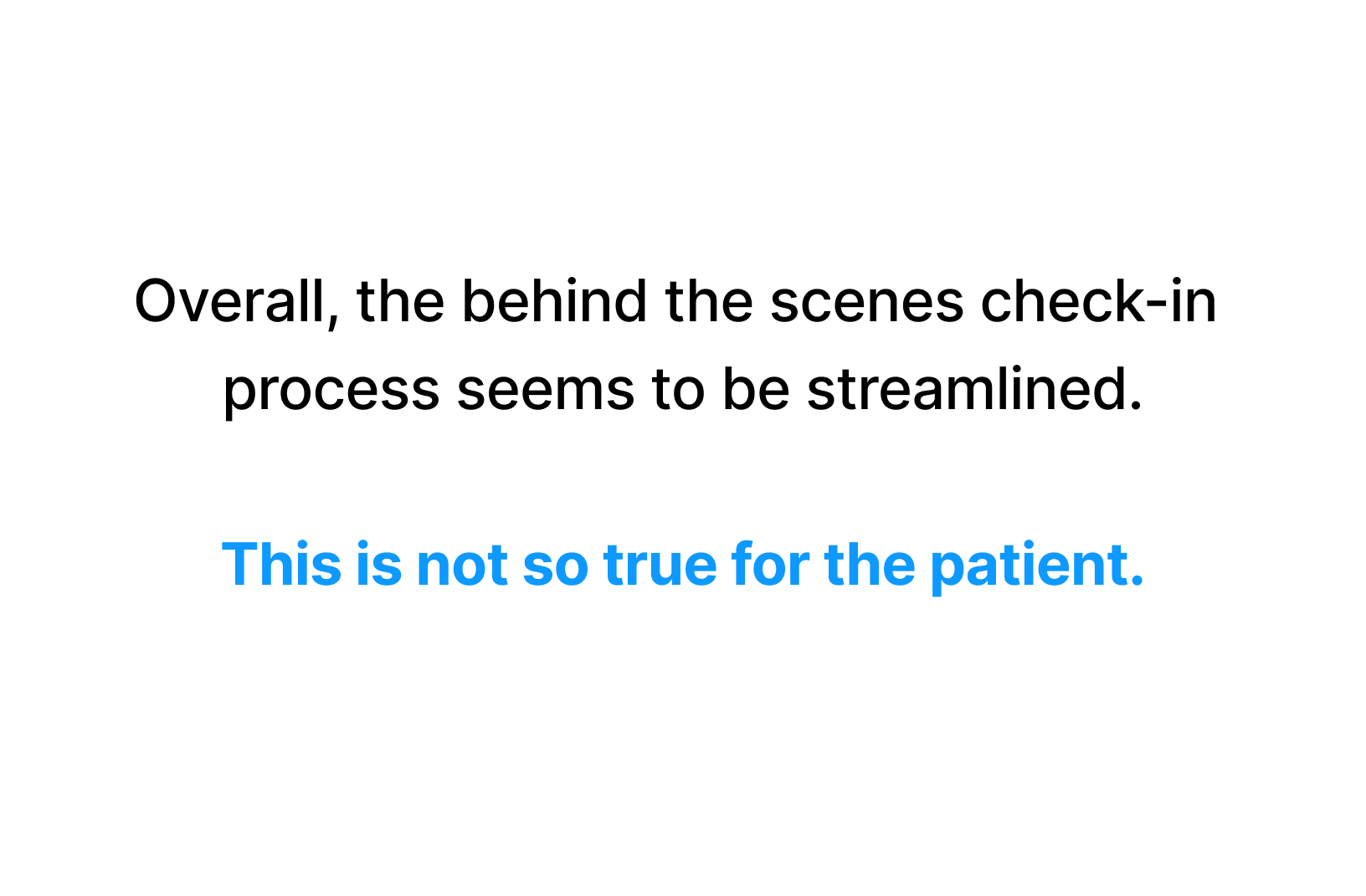
a domino effect, messing up the doctor’s schedule.Online EMR and MyChart software helps with behind the scenes documentation and patient communication.
Older pediatric patients often don’t fully understand their insurance policy
Interviews with Medical Professionals
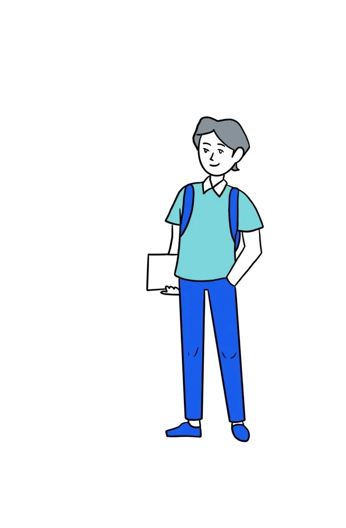
Our group interviewed 4 patients that had recently been to the pediatrician or physician. The main takeaways from these four include:
Many patients agree that it would be easier if the check in was online (filling out forms, etc).
Patients prefer in person visits rather than telehealth visits because they are able to create an emotional connection with the doctor and have more trust.
Most patients get a reminder text or email about their appointment. This shows that pediatric offices value staying on schedule.
Many pediatricians still use traditional check in methods; using a clipboard and sheets of paper. Patients expressed that this can take a long time.
Adult doctors often use MyChart, which is an easy way for the patient to access their healthcare information and history as well as prescriptions.
Interviews with Patients
Needs and goals
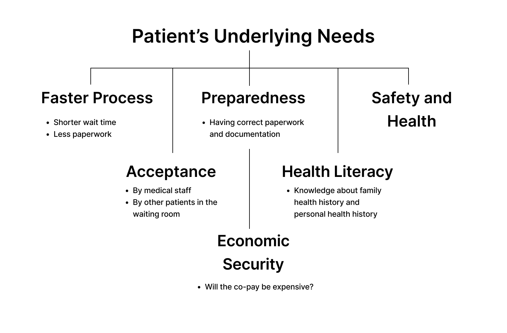
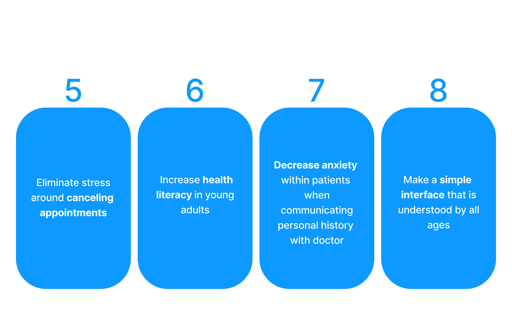
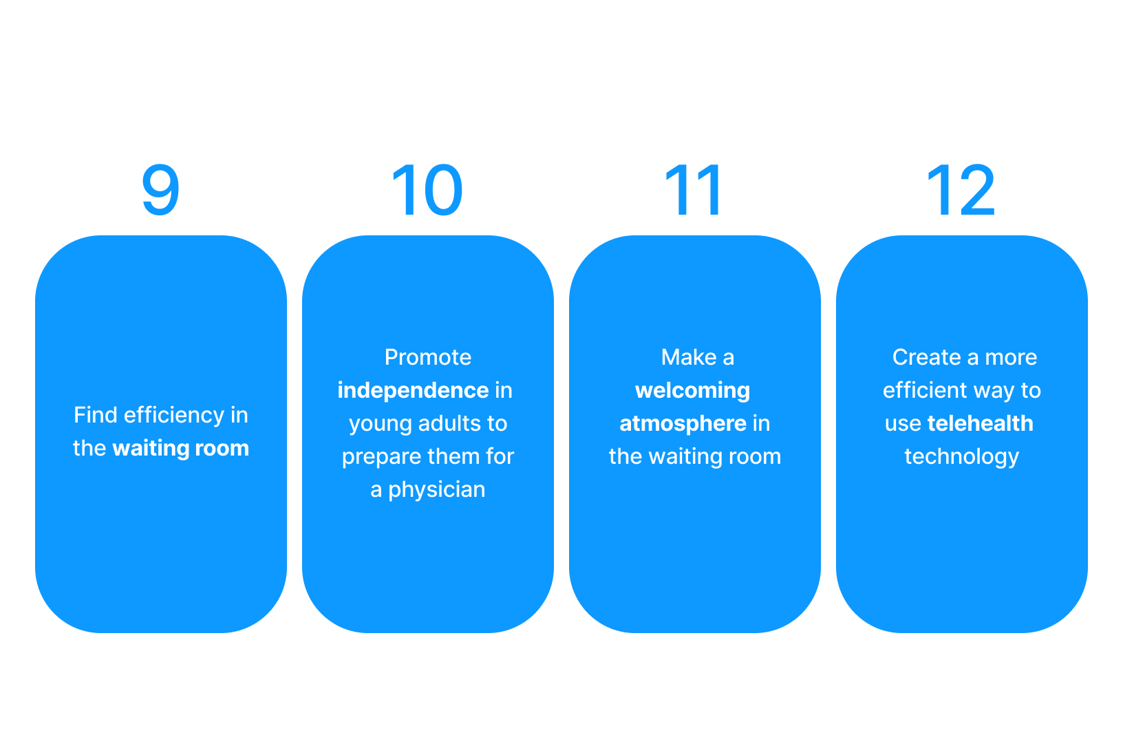
Based on these initial interviews and research, we then decided on some key needs and goals for the patient.
market research
After researching the different products already available on the market and considering the needs of each persona, we came to some overarching design goals that we will use as starting points for our various design concepts. Taking these goals in mind, we hope to be able to find a way to help improve the check in experience at pediatric primary care offices for patients ages 18-22.
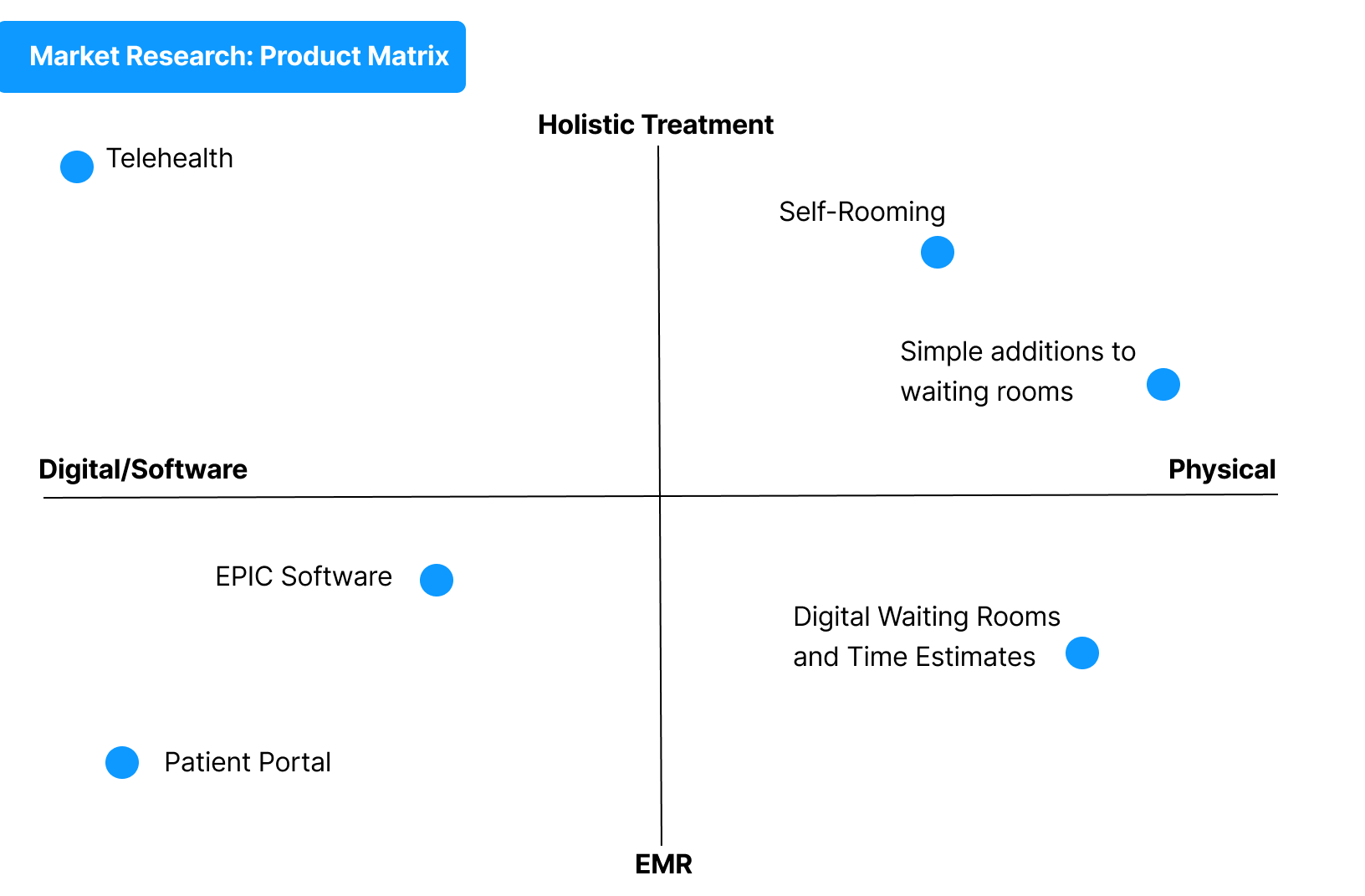
A key point within the research was researching products that were already on the market. Thus, below is a summary of our market research organized into a product matrix. This allowed us to create more specific needs for the user based on what these products are unable to offer to the patient.

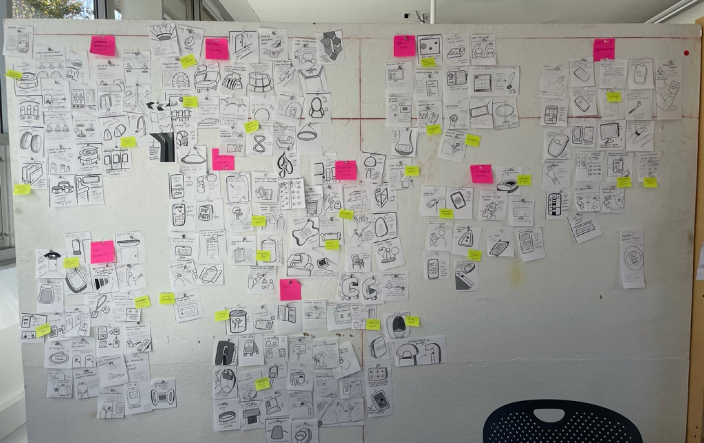
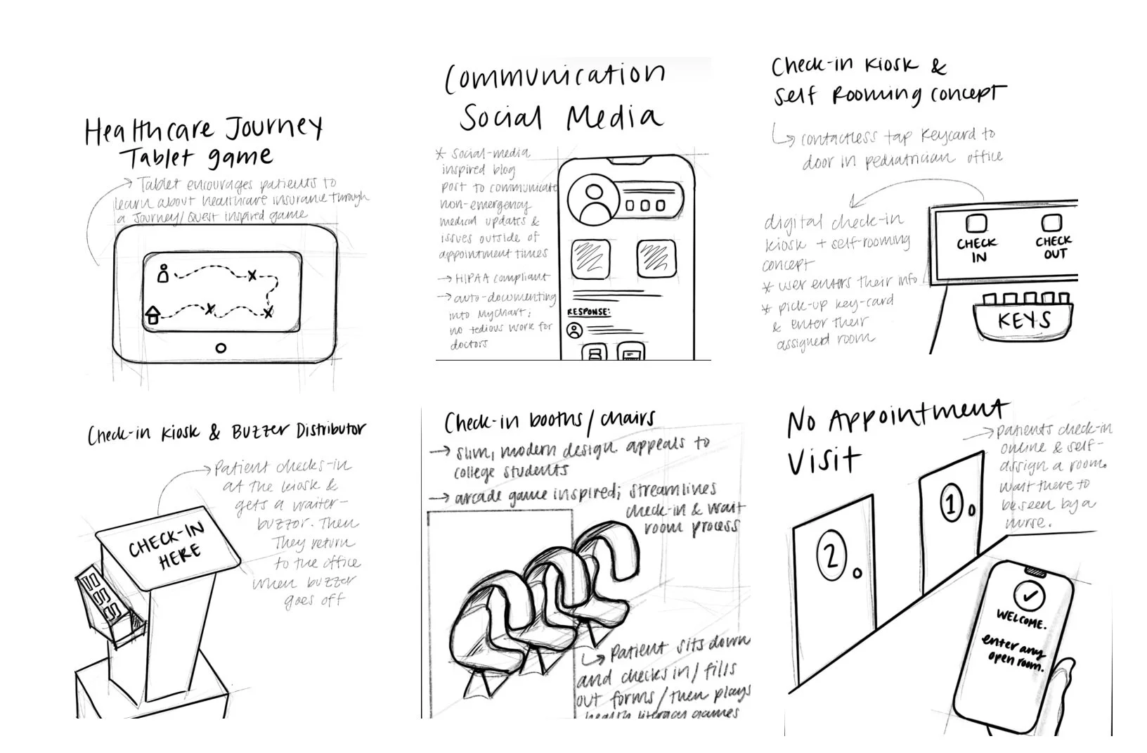
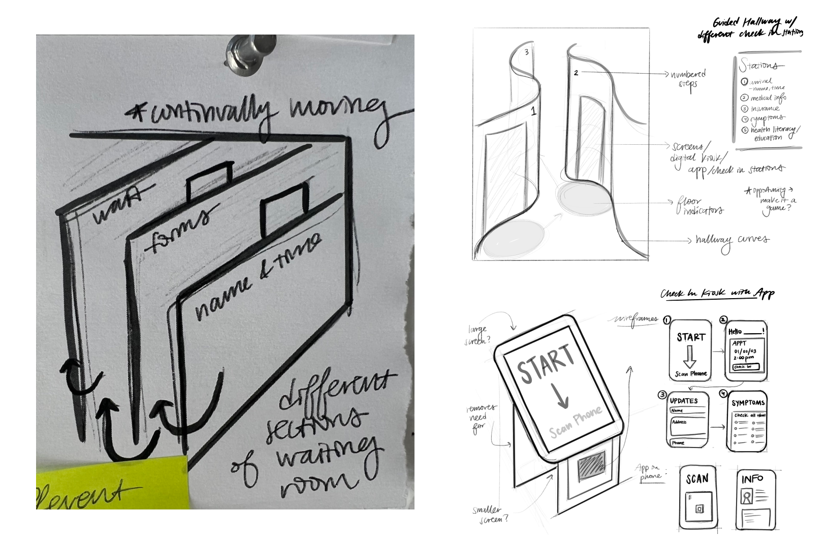
Concept Ideation
To start brainstorming some concept ideas, we sketched over 200 different thumbnails sketches, and then cut them out and organized them into different design parameters as shown below.
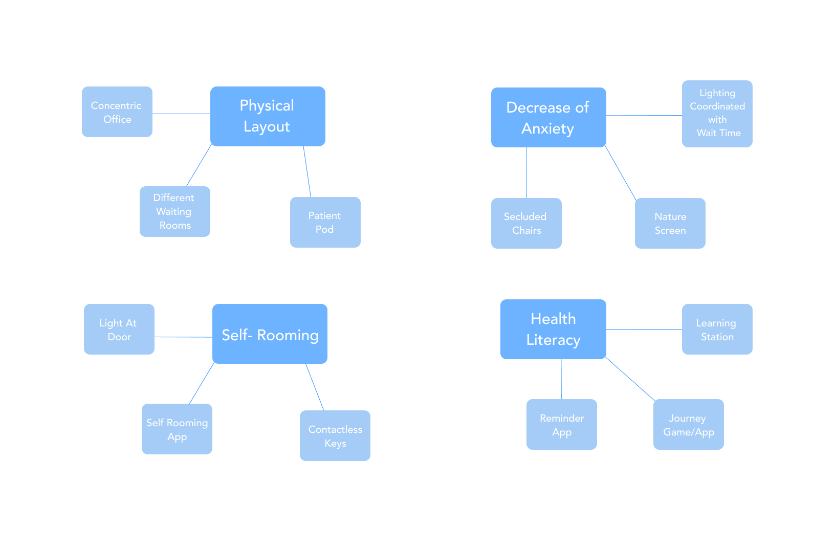
Design Parameters
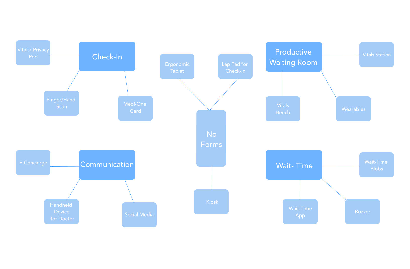
Thumbnails
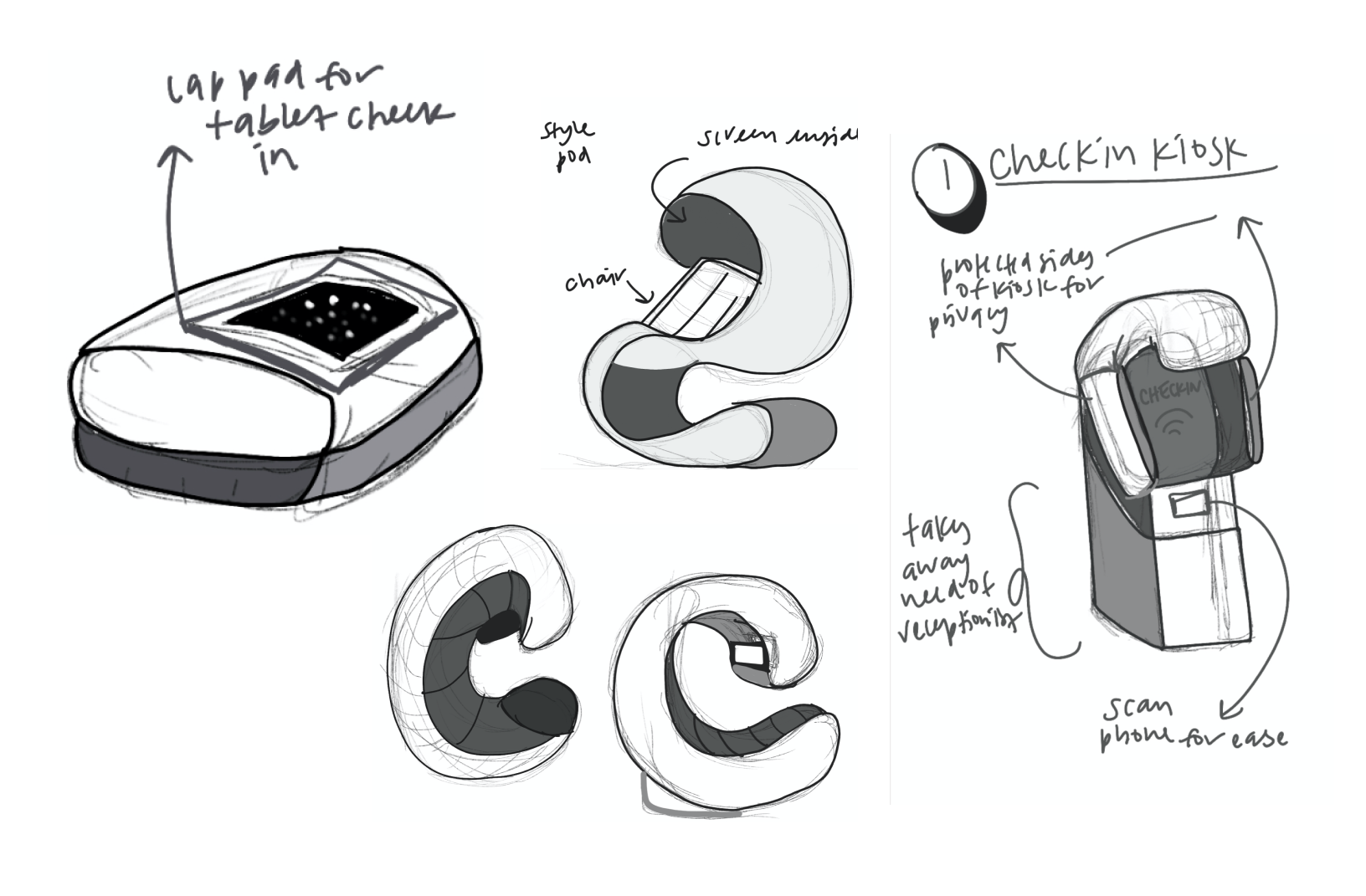
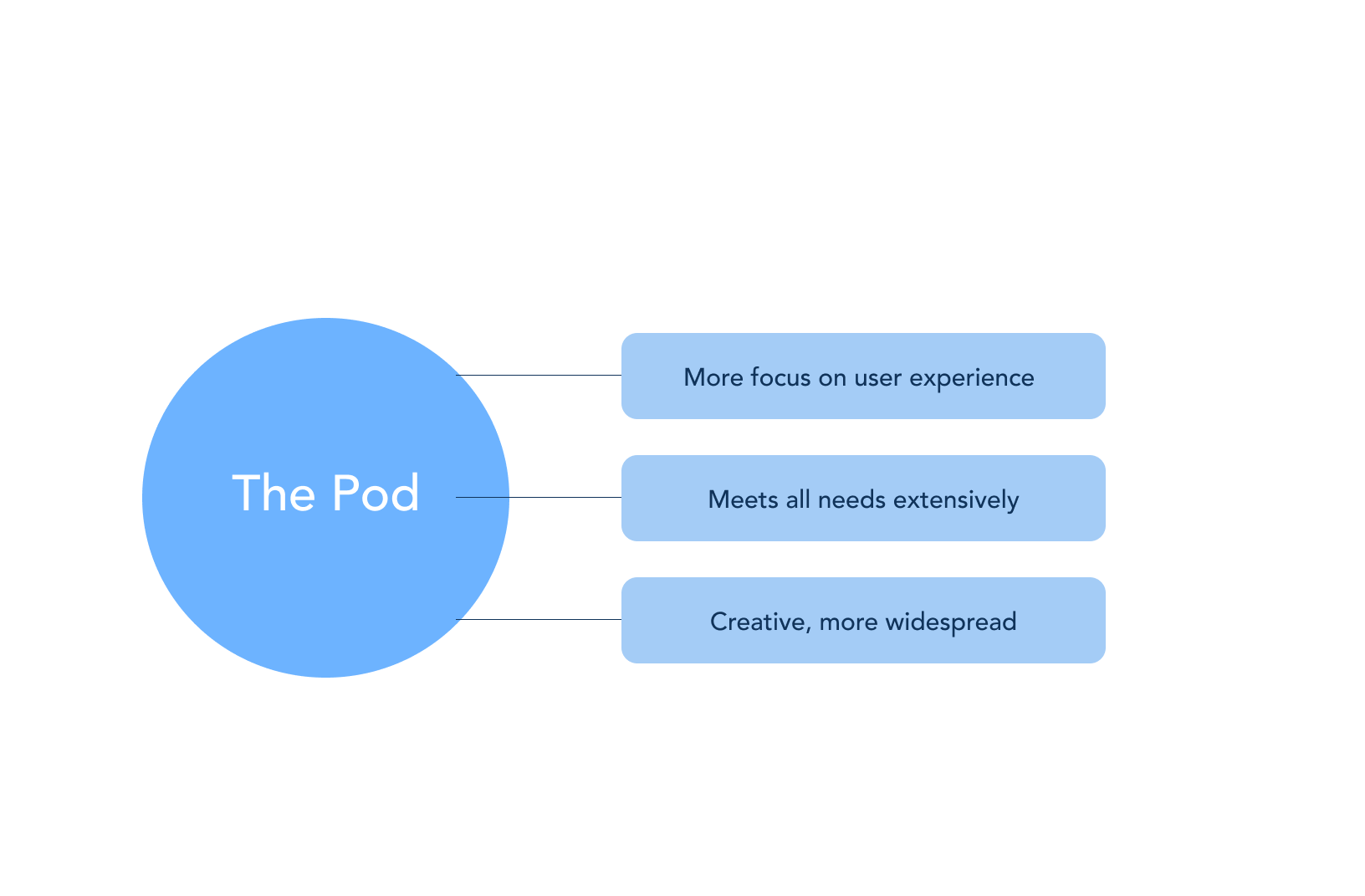
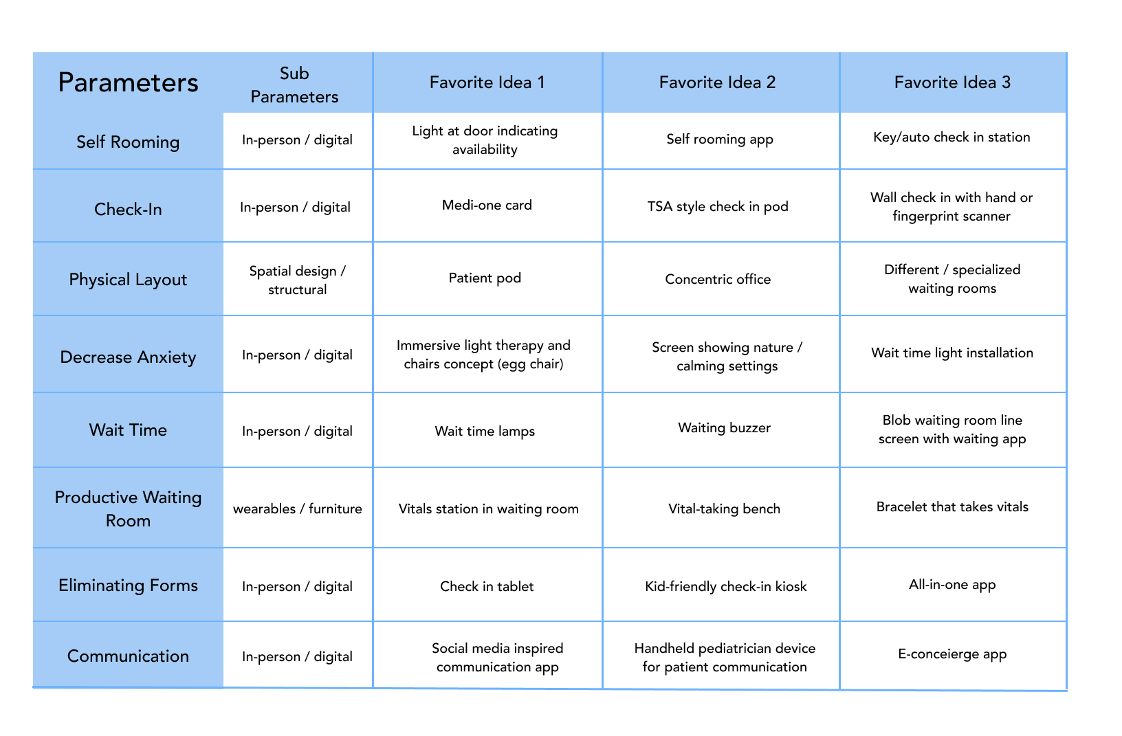
Chosen Concept
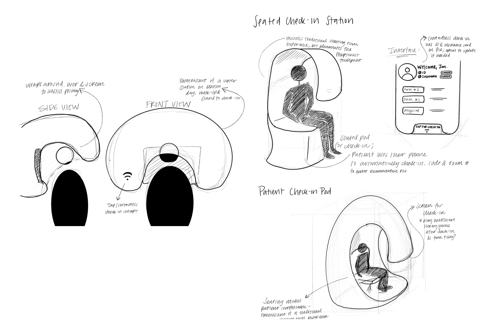
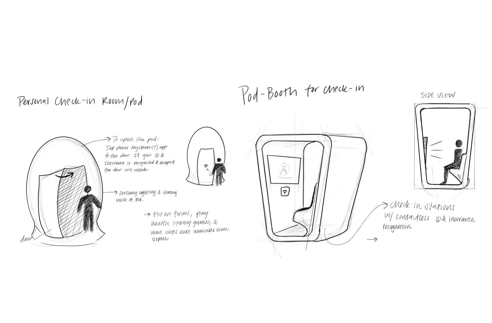

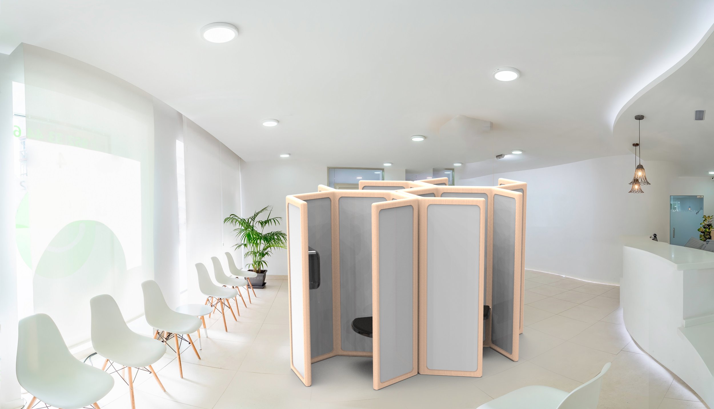
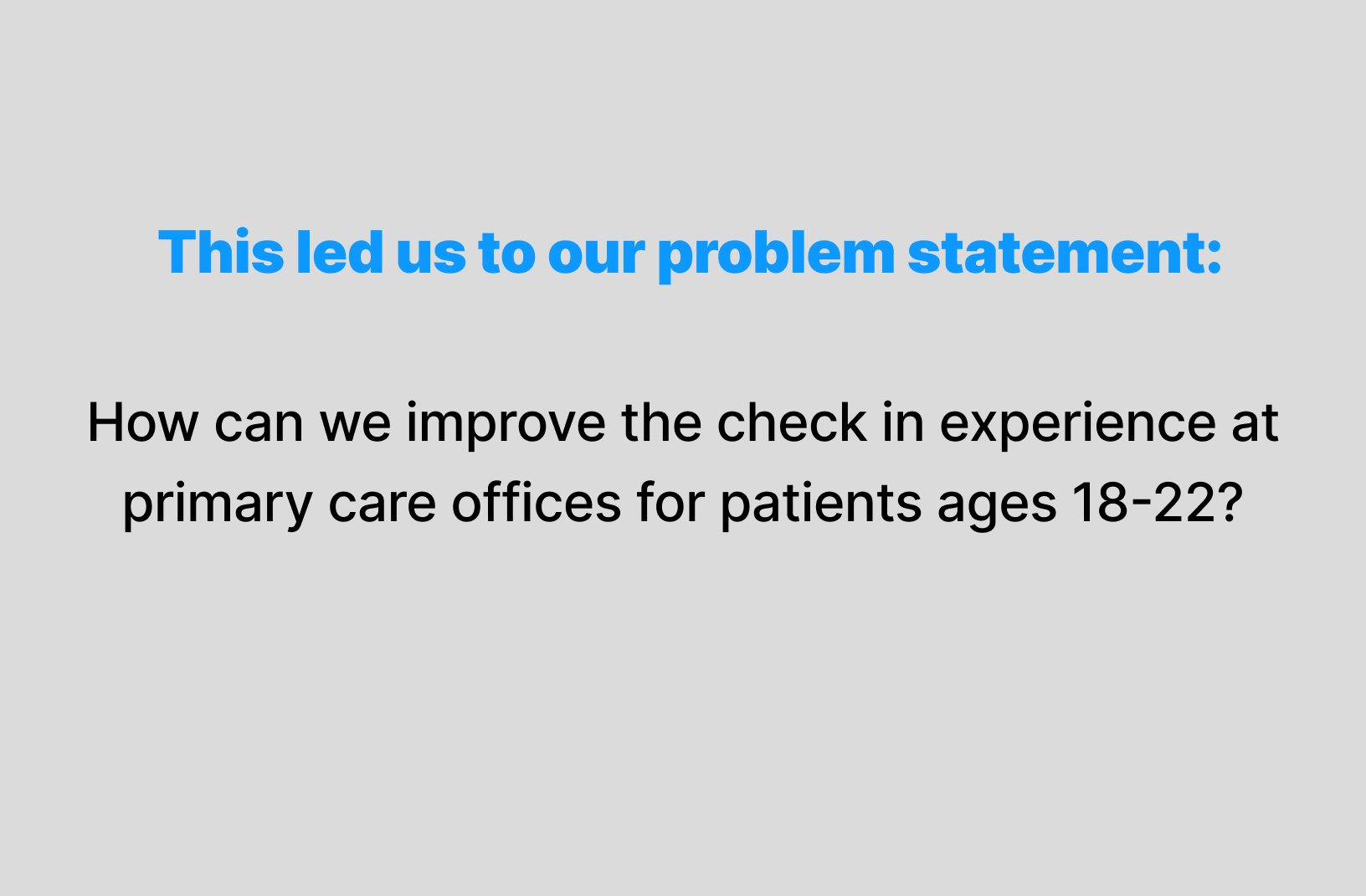
We decided to focus on ‘The Pod’ experience as the solution to our problem statement, how can we improve the check in experience at primary care offices for patients aged 18-22? The initial sketches and designs are presented below.
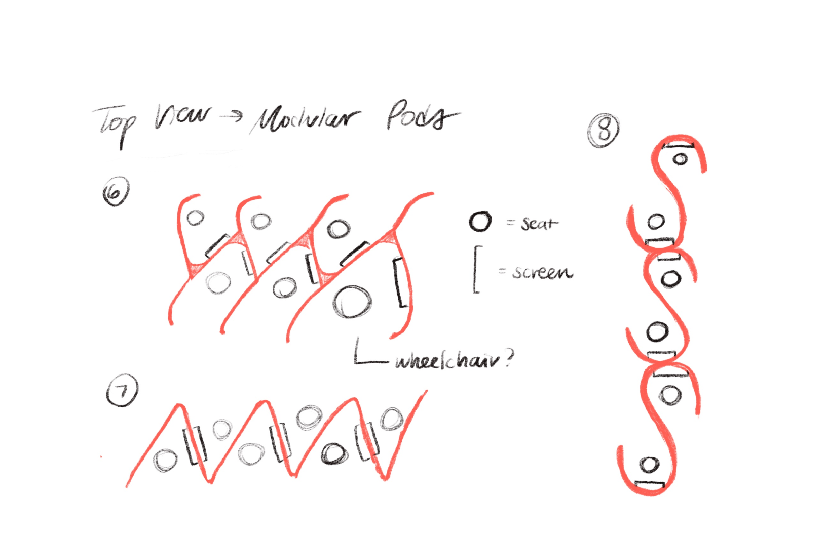
Journey Mapping With pod

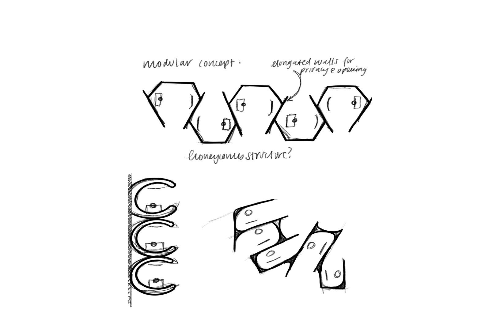
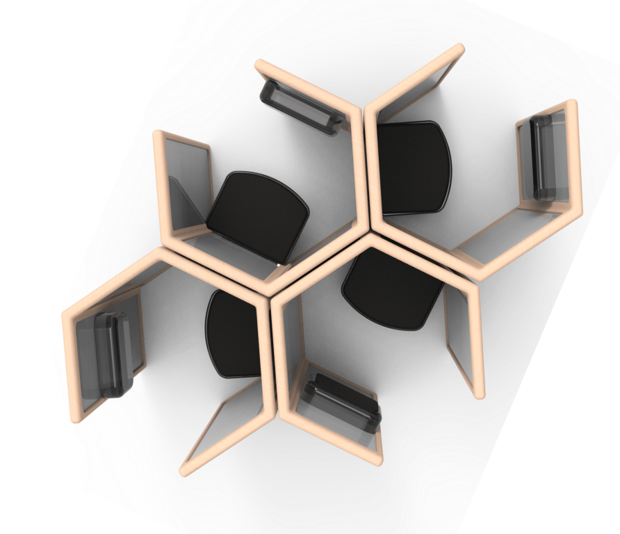
A modular approach
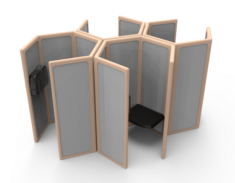
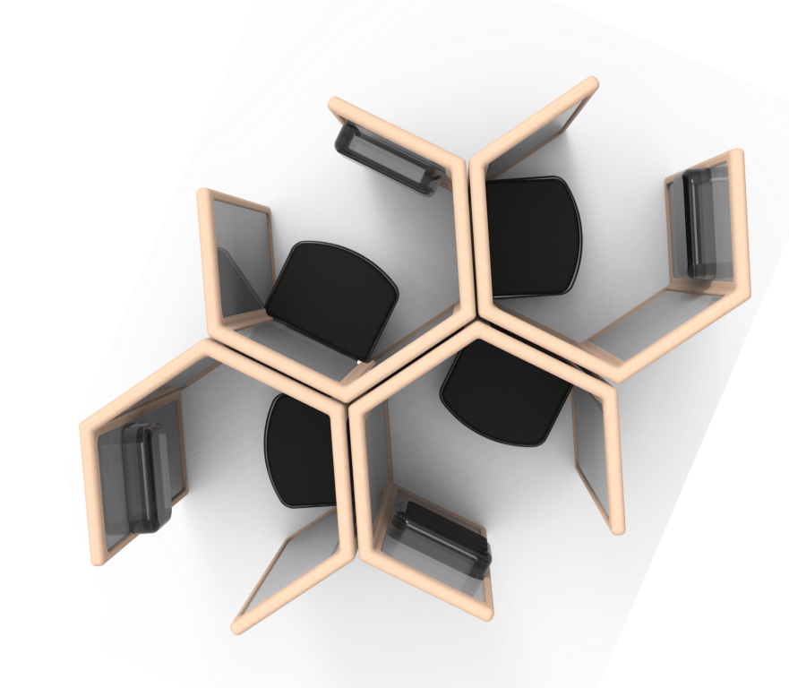
After initially sketching various pod form concepts, we decided to explore the concepts of a modular approach, or more so a collection of pods that can be configured in different ways, adapting for different customer needs.
Benefits of A Modular System:
Can fit in any size waiting room
Creates a dynamic and interactive layout
Designated individualized spaces
Establishes continuity within the flow of the waiting space
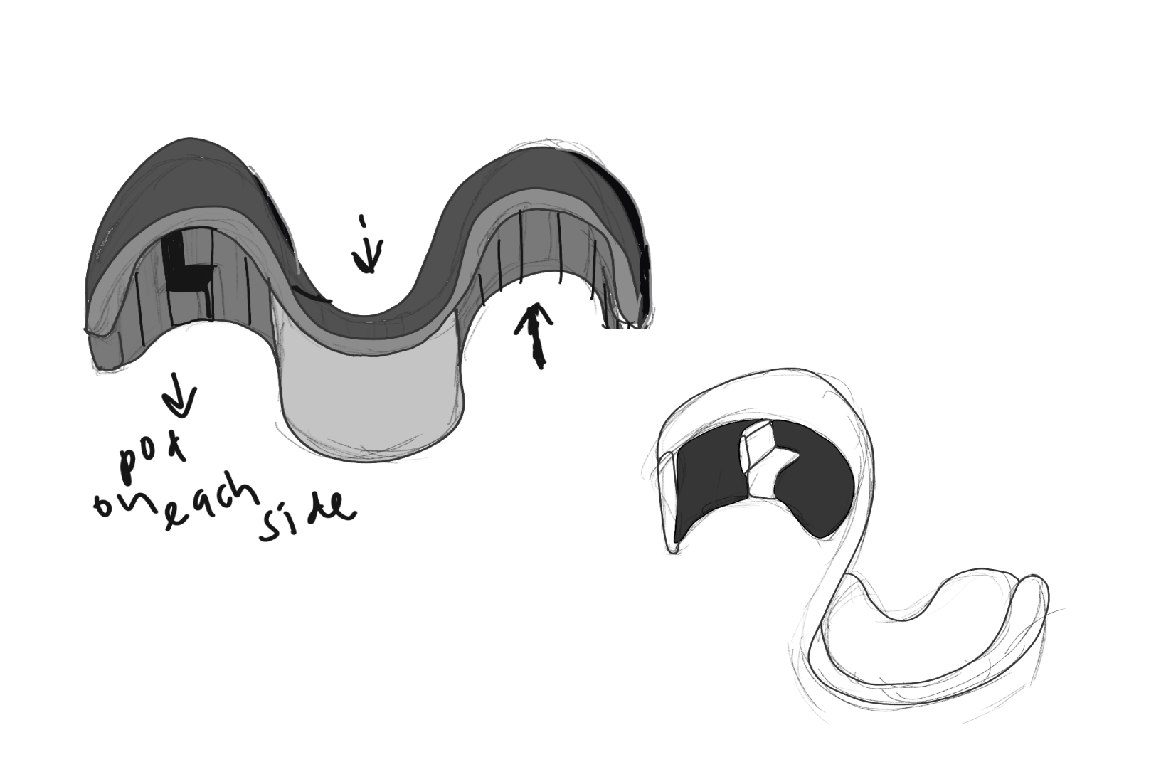
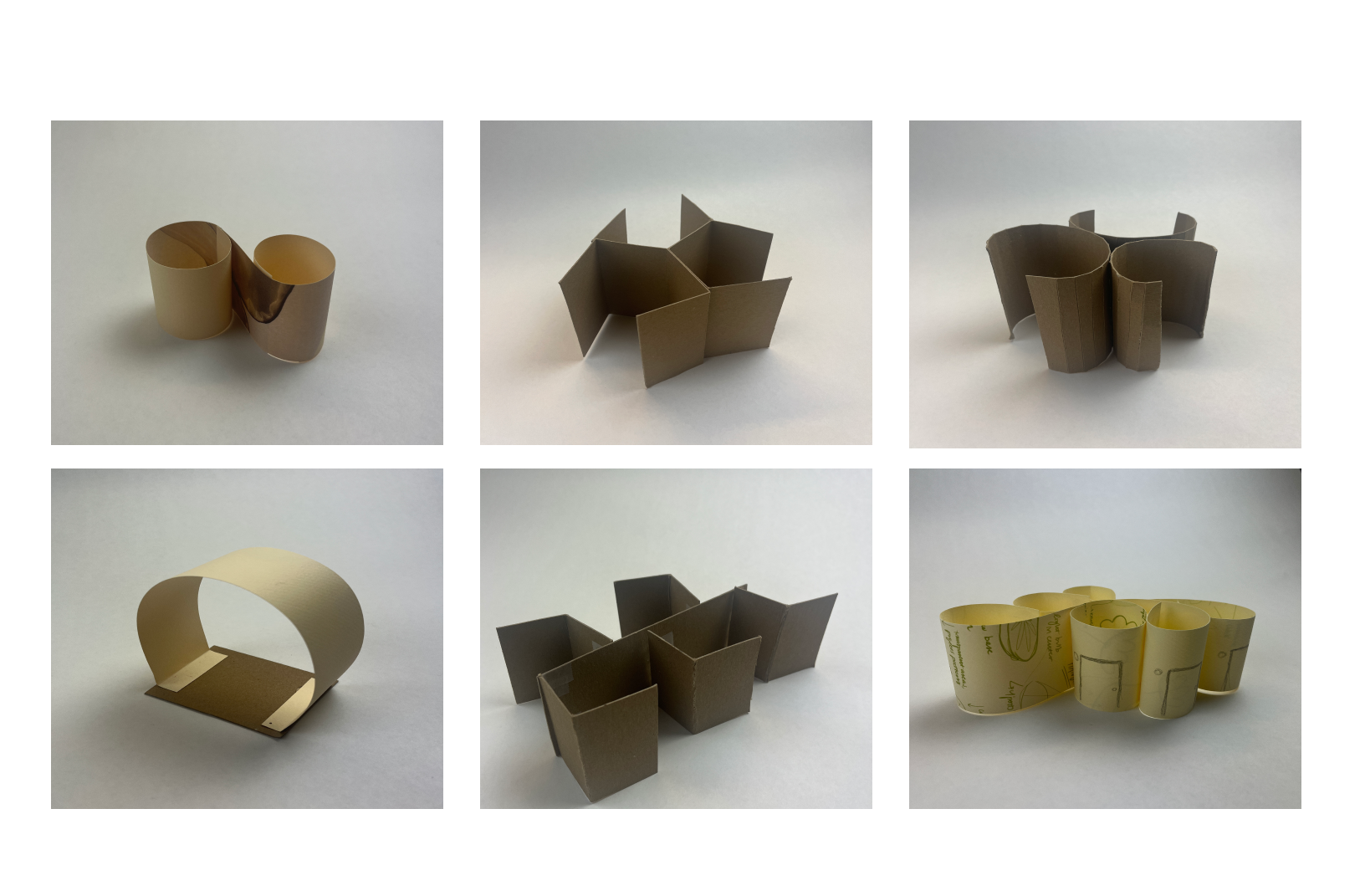
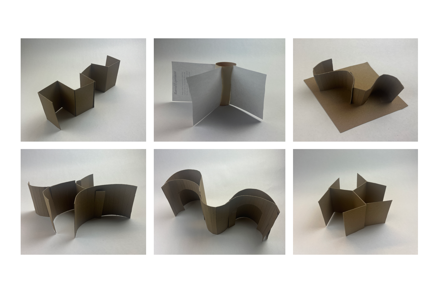
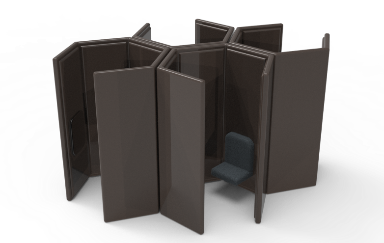
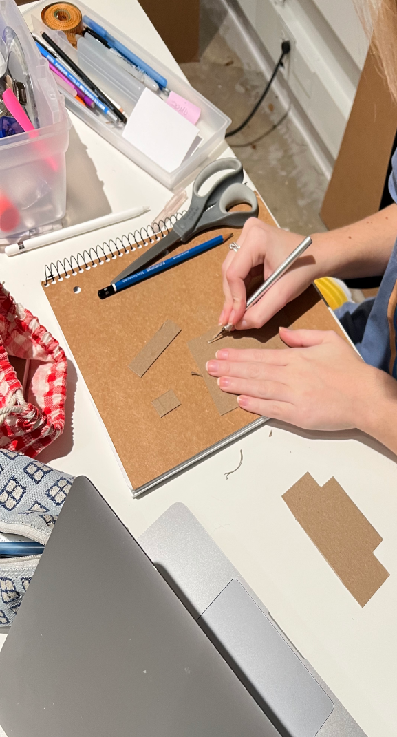
Modular Chip Board Models
Different Pod Concepts
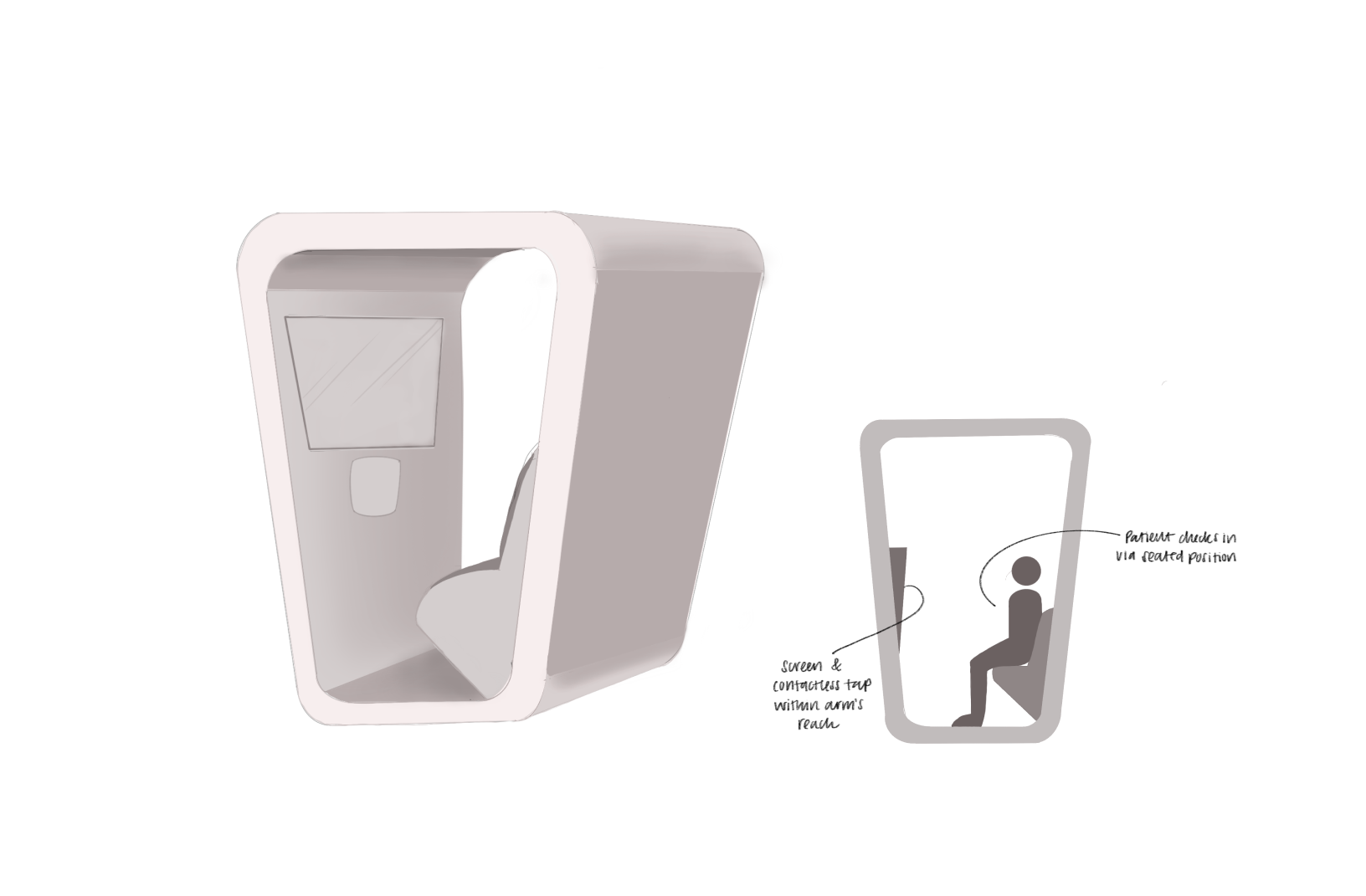
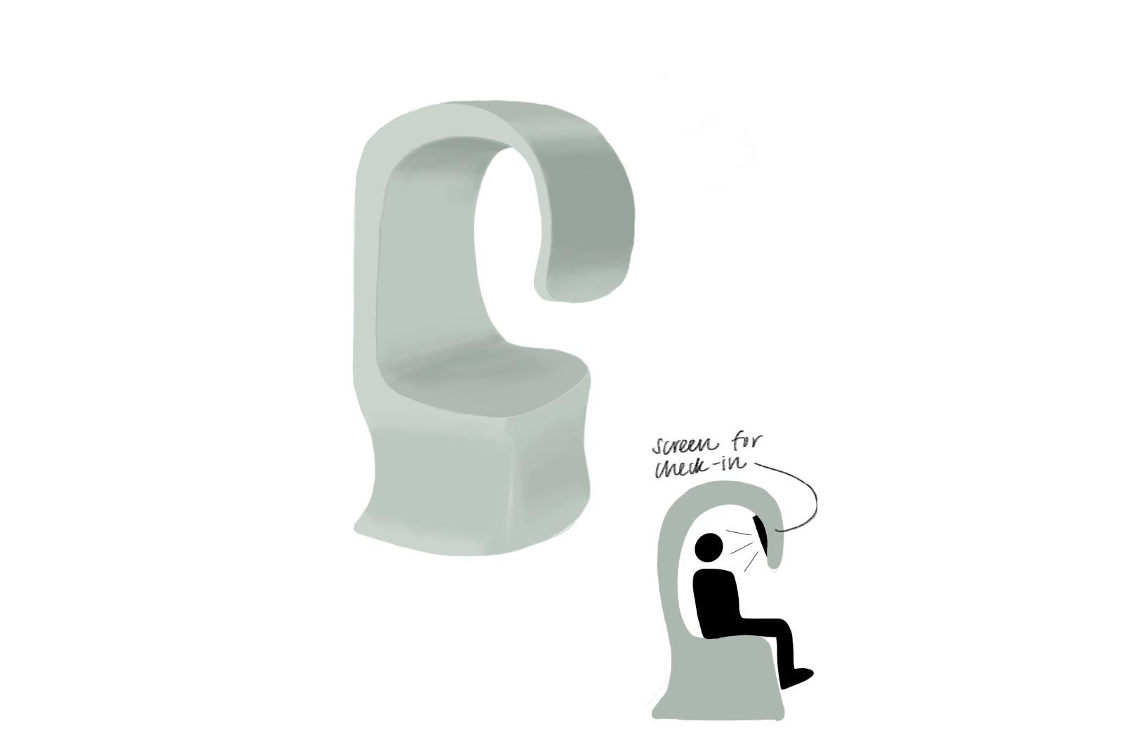
Based on these modular sketches and models, we decided to make and render different CAD models to get an idea on how the pod would look with its original CMF.
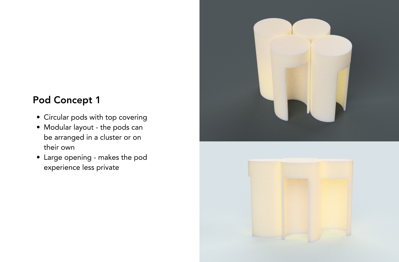
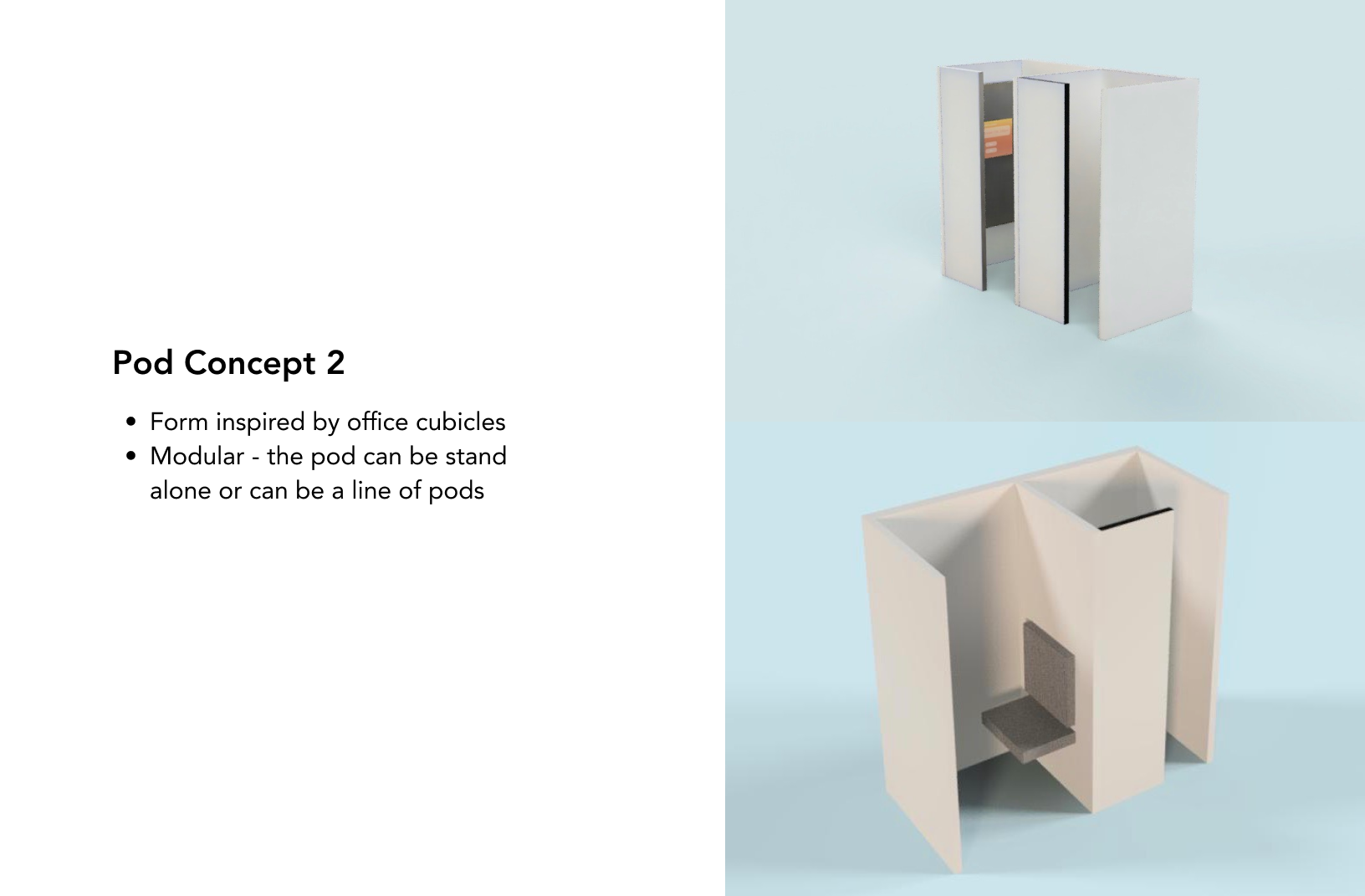
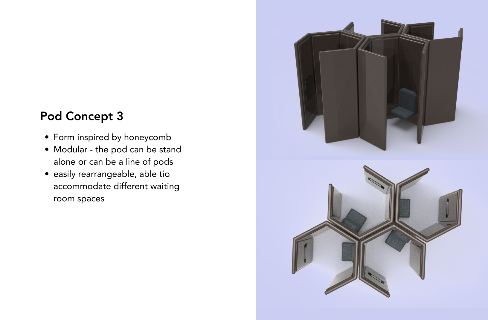
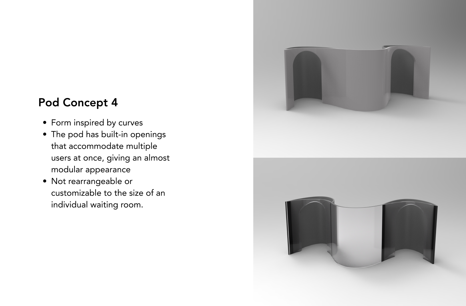
Pod 3 was consistently the most favorable in regards to every factor: comfort, safety, accessibility, and aesthetics. This made it an easy decision to continue with this design throughout the rest of our project. Additionally, the hexagon shape allowed for a cohesive and structural modular structure within the pod system to allow for easy access and comfort, which was one of our main goals within the design.
cHOSEN POD CONCEPT
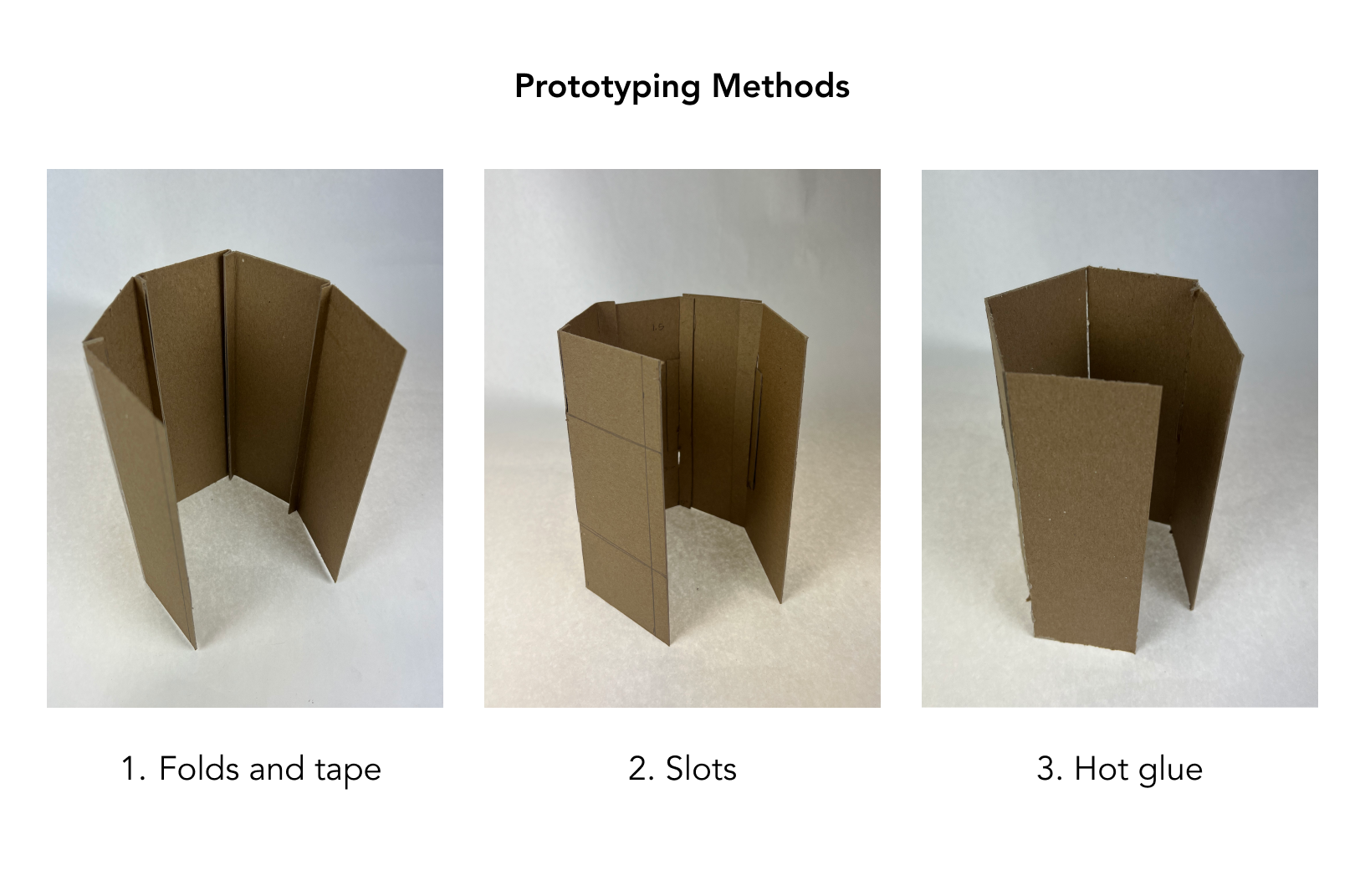
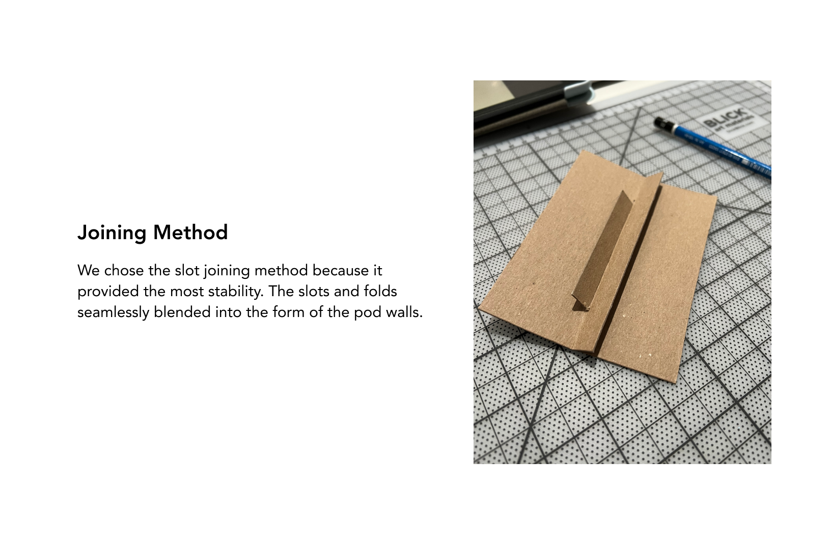
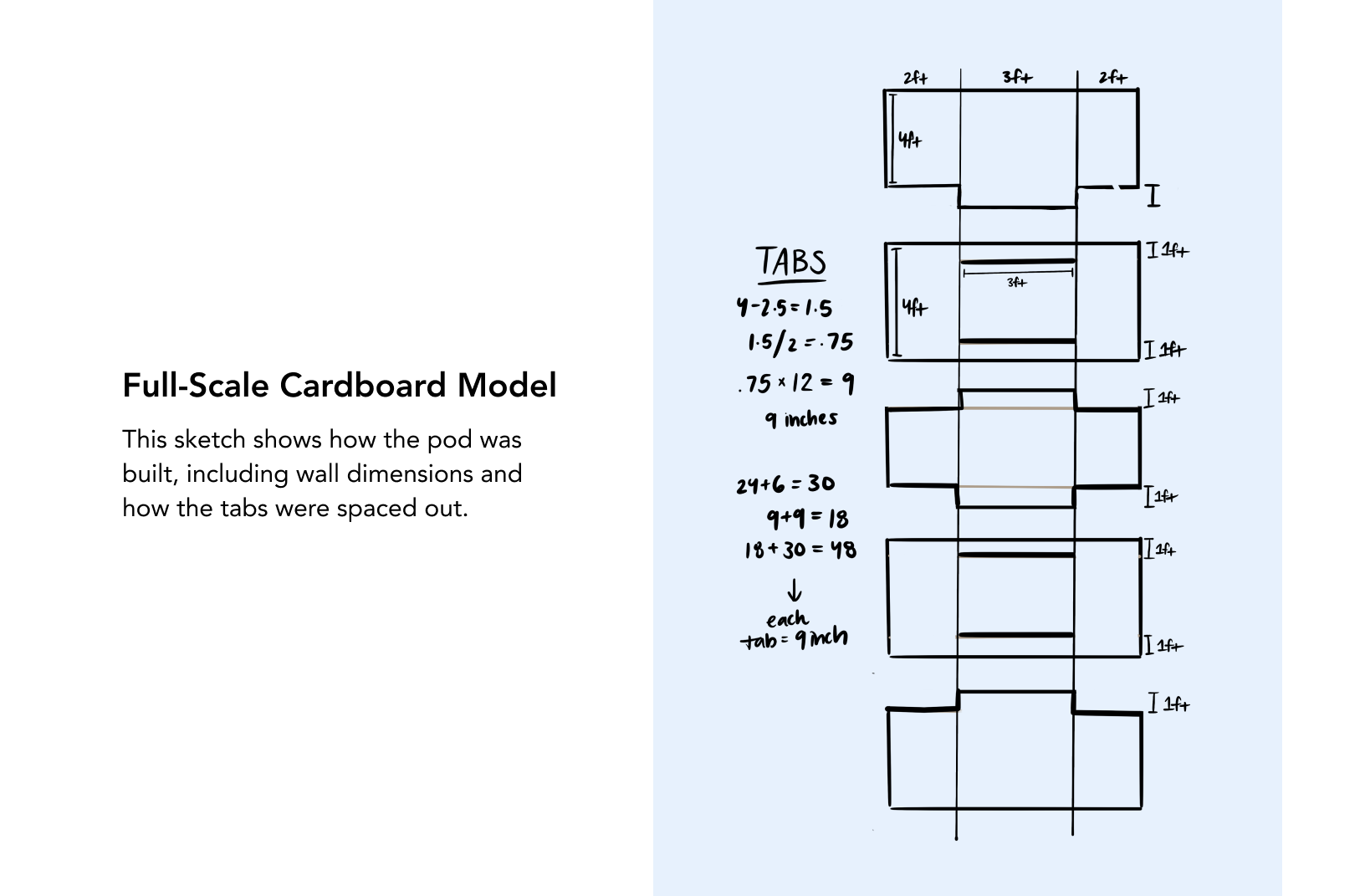
To get a sense of how the modular structure would fit as a pod, we made a few low fidelity chipboard models. This also helped finalize what design we wanted to purse for the final concept.
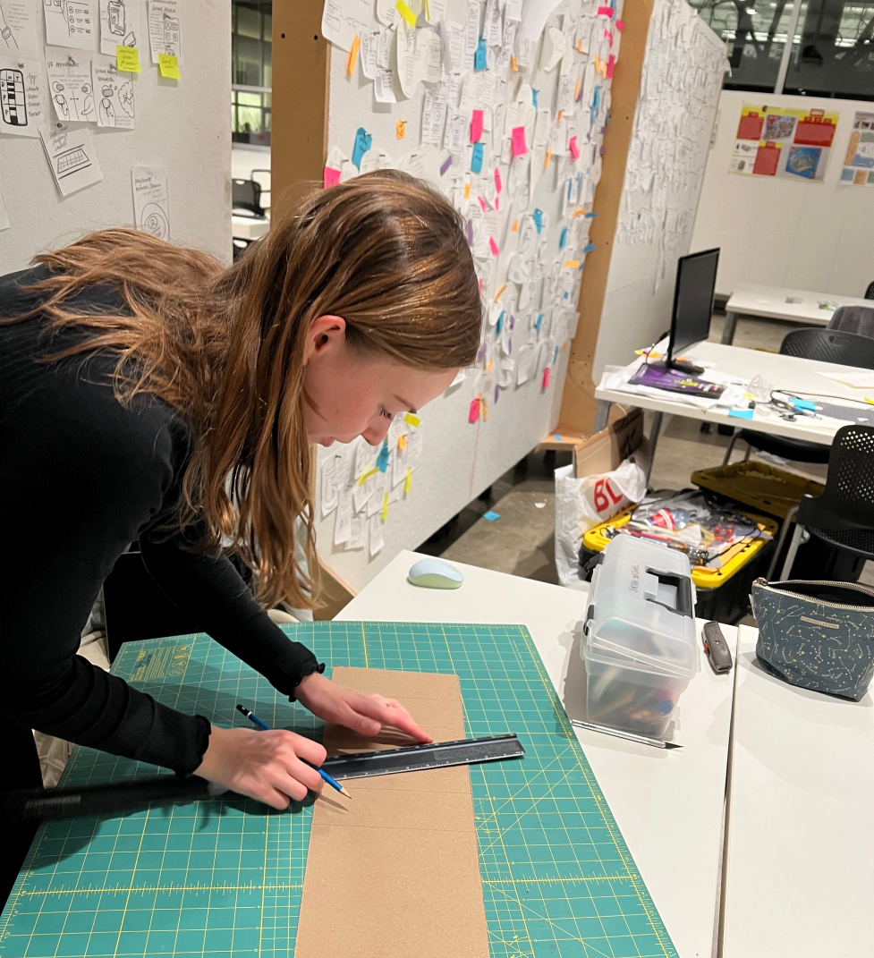
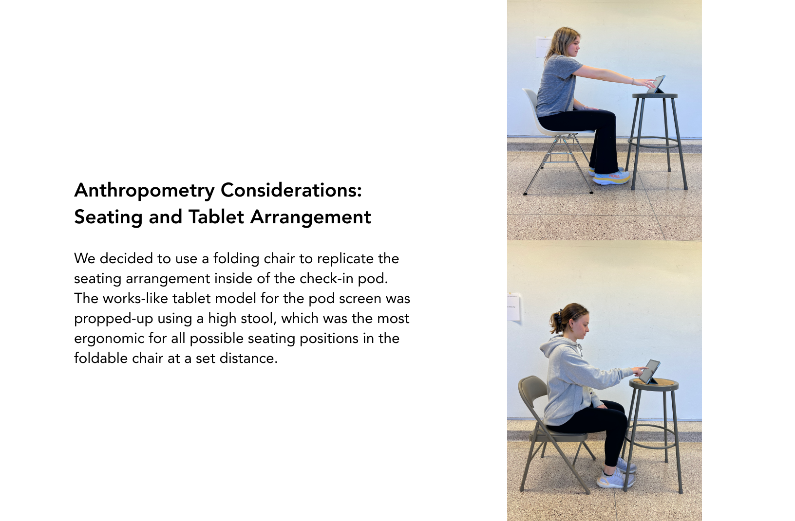
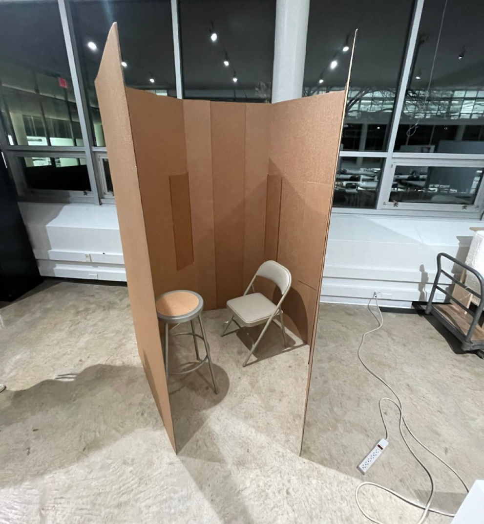
Building the pod
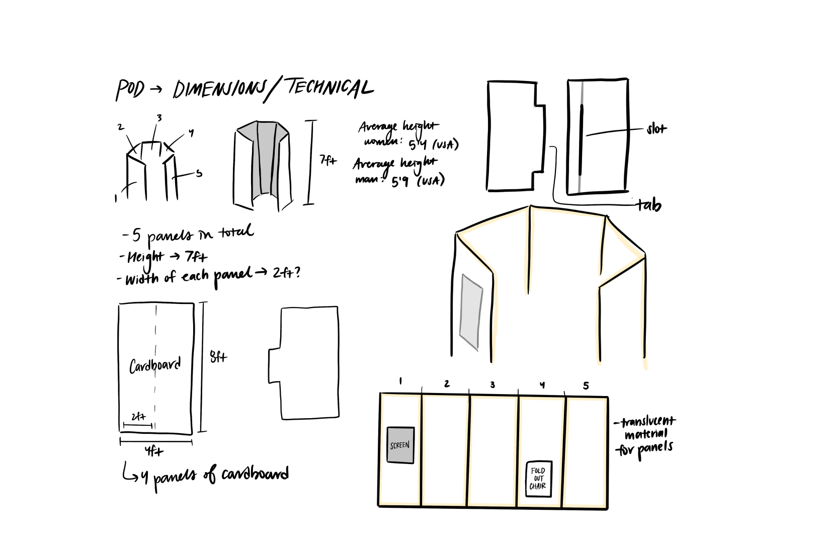
To receive more user feedback to achieve the highest quality of design possible, we made a cardboard structure of a singular pod in order to conduct user testing to gain additional intel between the patient and the space.

The app

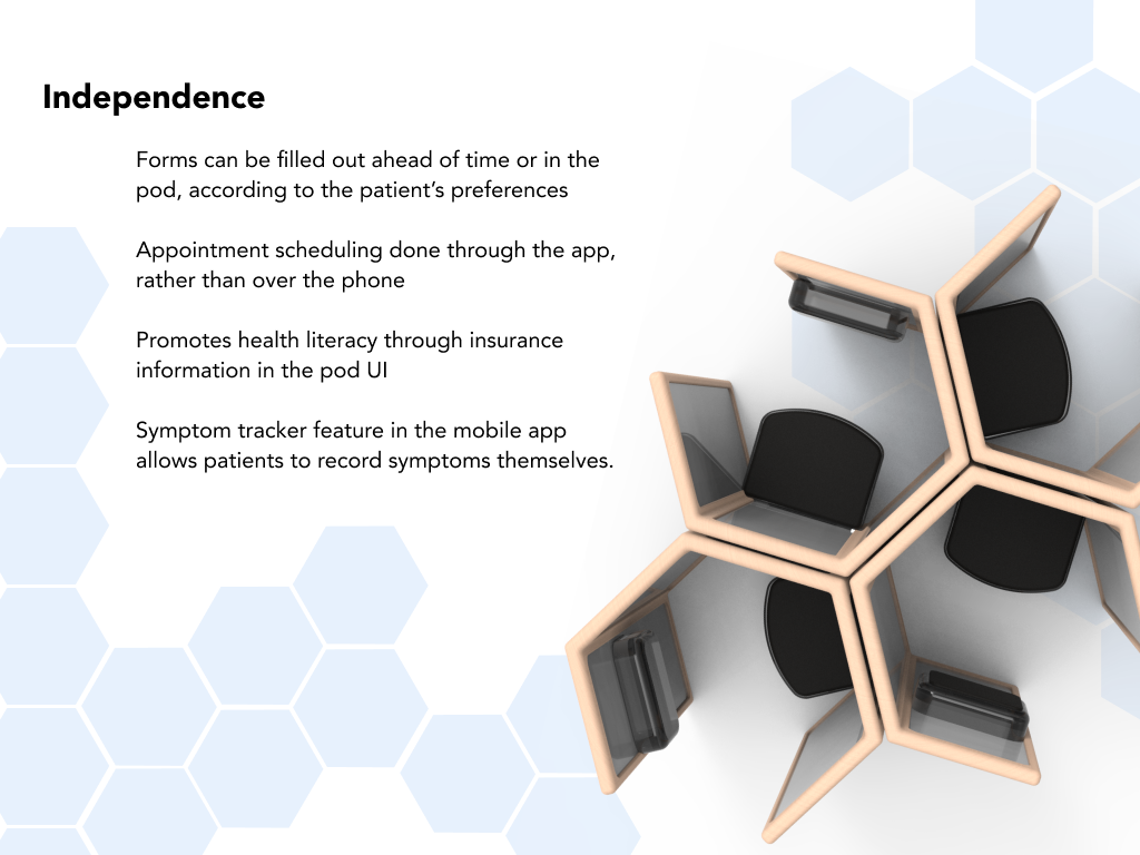
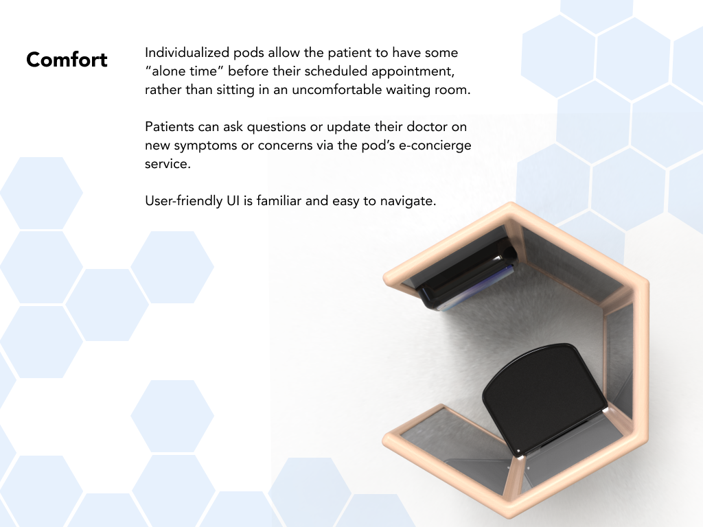
To go along with the structure of the pod, we decided to create a corresponding mobile app and app for the pod screen. The app serves as a healthcare hub for the patient. Before they arrive to their appointment, they can fill out required forms. They are able to easily access their medical history (immunizations, surgeries, test results, past visits, etc.) and medications. Appointments can be scheduled from anywhere, without having to wait on the phone with a receptionist. Patients are able to confidently take charge of their office visits with the help of the symptom tracker and e-concierge service.
The button below goes more in depth with the user experience of the application for both the mobile device and pod screen.
Features:
Check in
Personal ID
Forms
Symptom tracker
Medication
E-concierge
Appointments
User Testing
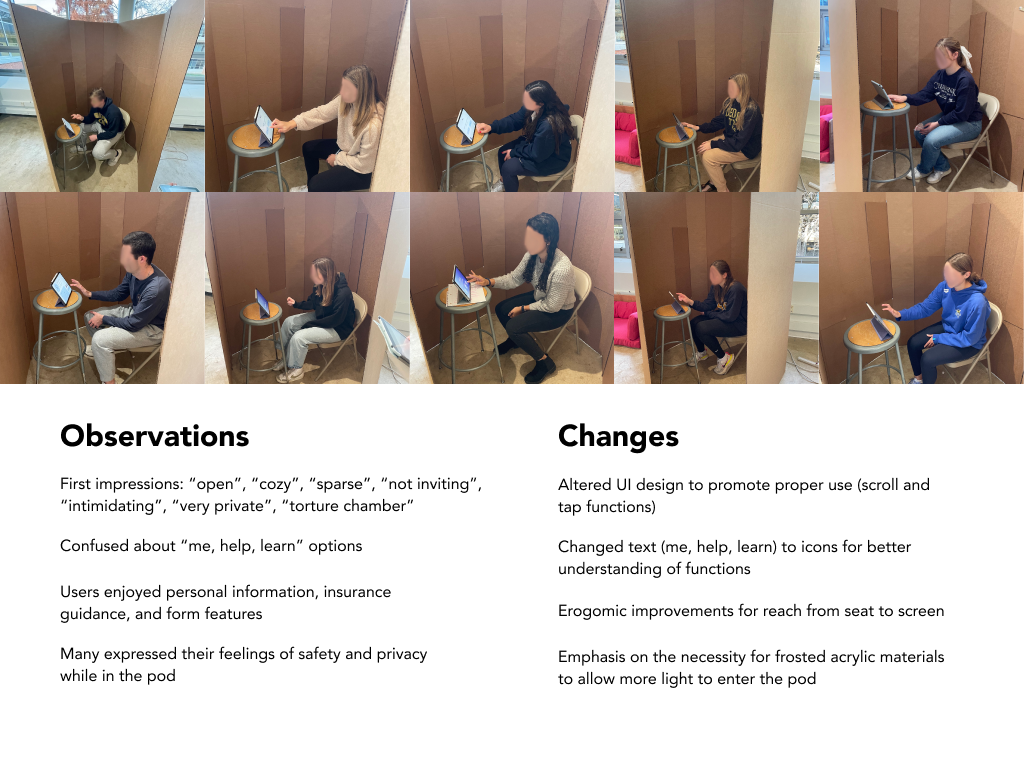
We user tested a few fellow peers and individuals who were in our target age range for the pod. We took their initial observations and acted on them to make some changes for both the pod and the corresponding apps to fit our design goals.
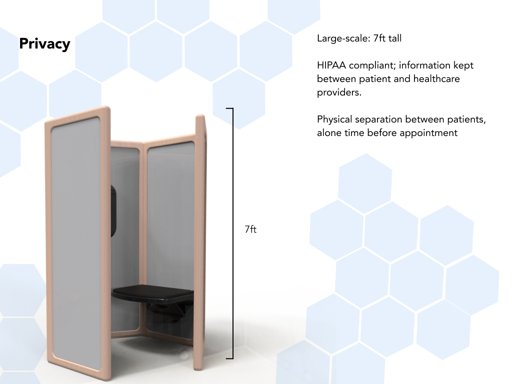
Privacy
One of our main goals was to emphasize the privacy of the patient’s medical information through HIPPA, but also in a way that isn’t too separated from the typical waiting room. Users described their impressions as “cozy,” “very private,” and “closed-off.”
Comfort
Since the material of the prototype was cardboard, users noted that there was not much of a welcoming atmosphere when entering the pod. Users described their experiences in the pod as “intimidating,” and “not inviting.” To ensure the comfort of the patient, we made sure to adjust the material in the final rendering to a frosted acrylic that will allow for more light.
Space and Accesibility
To accommodate for all types of people, including handicapped people, the size of the overall pad was a bit large, but to counter the space between the user and the screen, we adjusted the seat size to allow for maximum amount of accessibility and comfort. Users described this setup as “open,” “large,” and “sparse.”